MediCheck Background
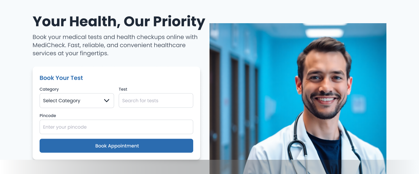
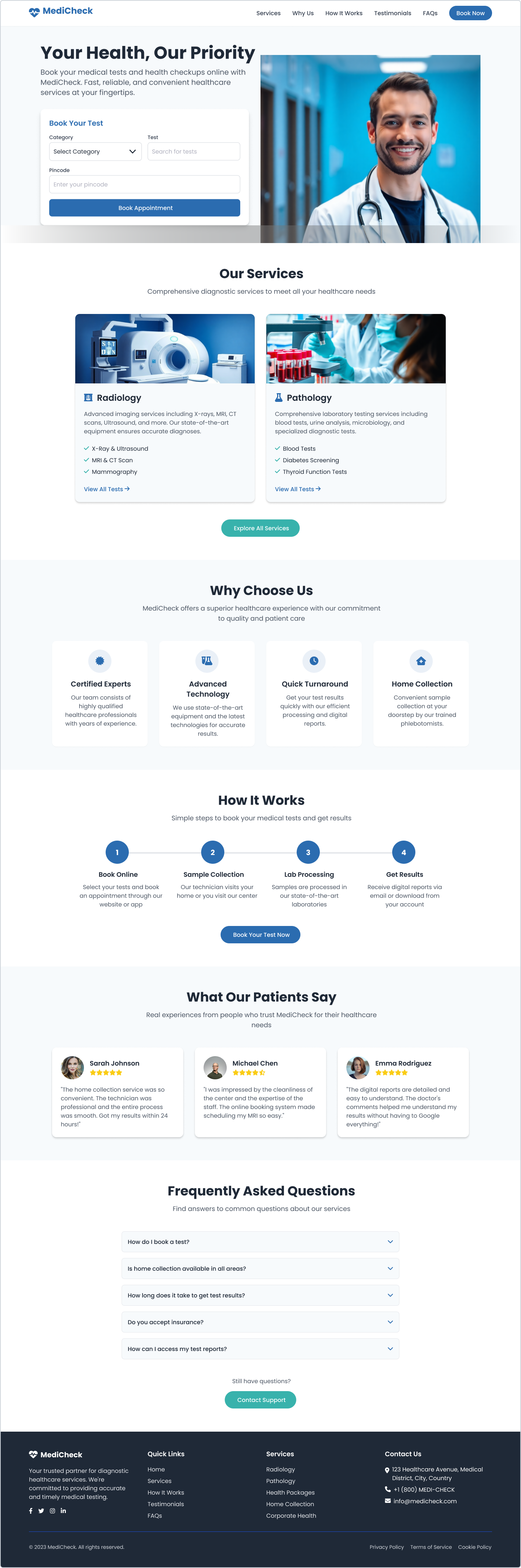
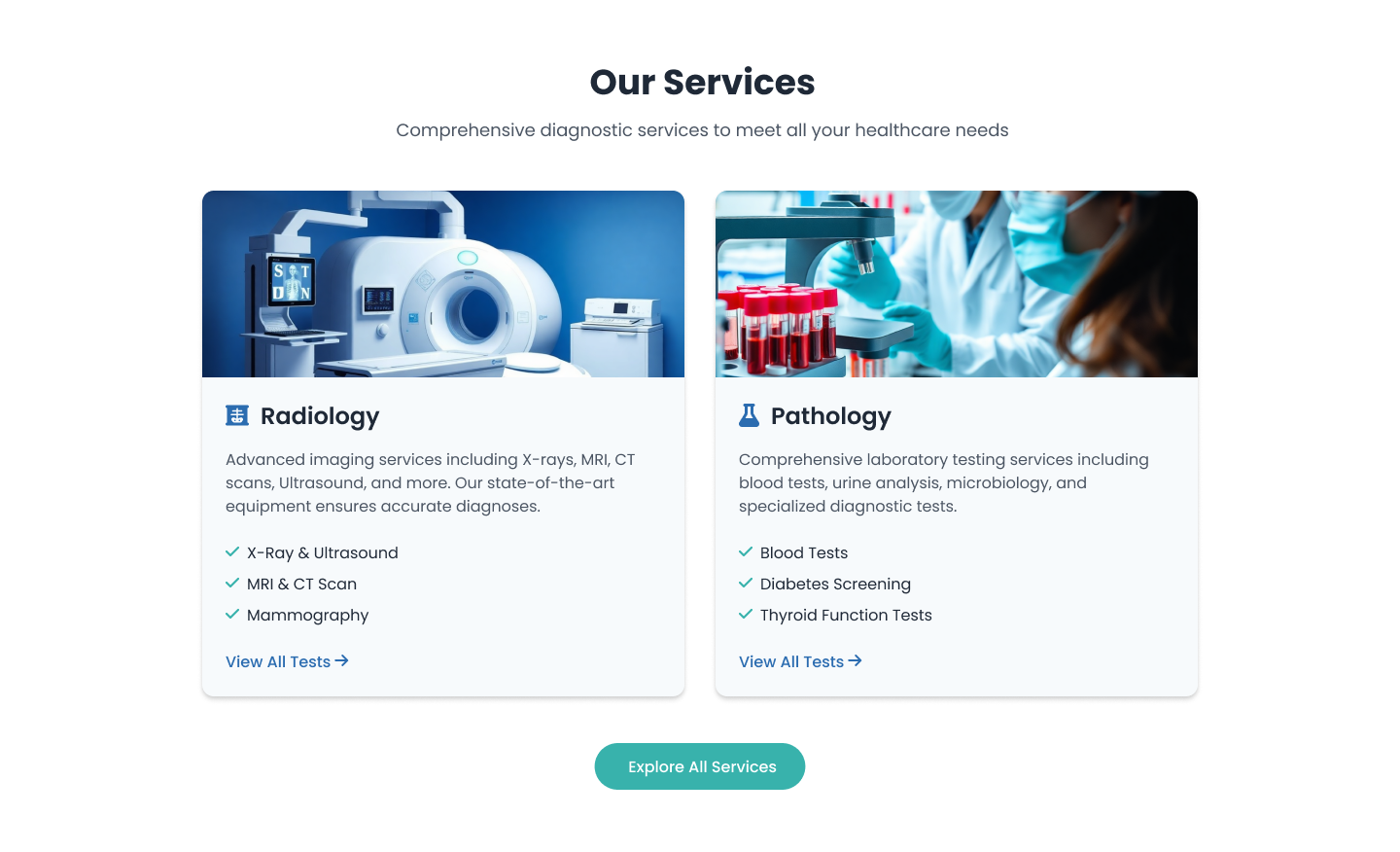
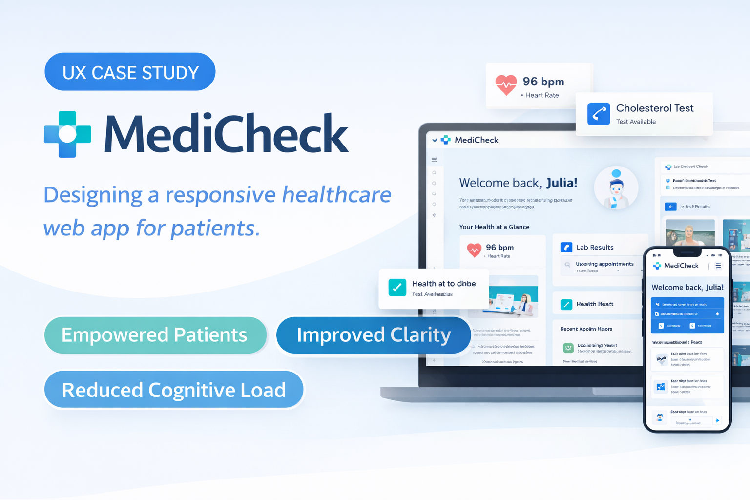
UX Case Study · Healthcare Web App

MEDICHECK

Role UI/UX Designer
Platform Web Application
Timeline 2023 - 2024
Focus Accessibility

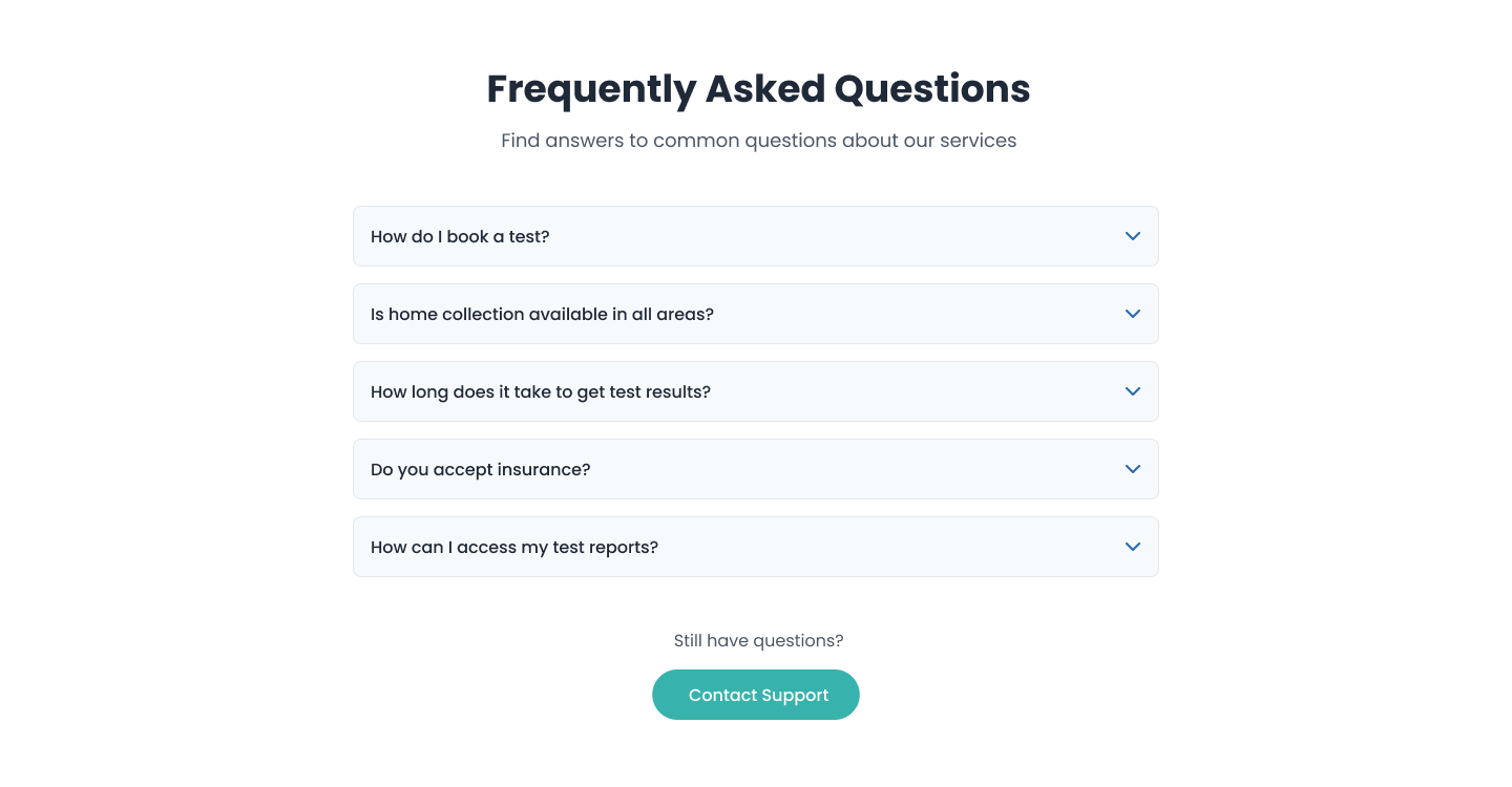
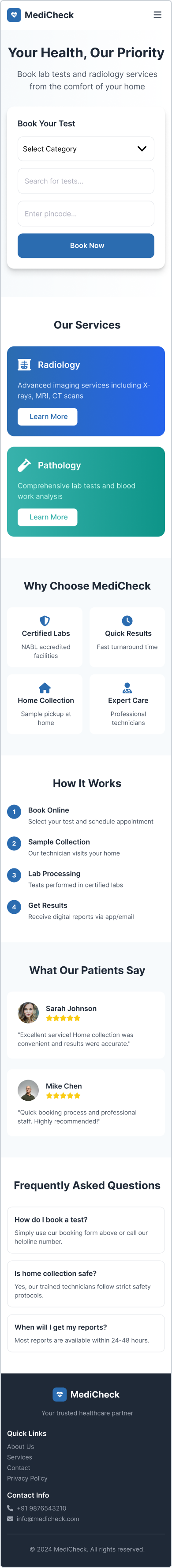
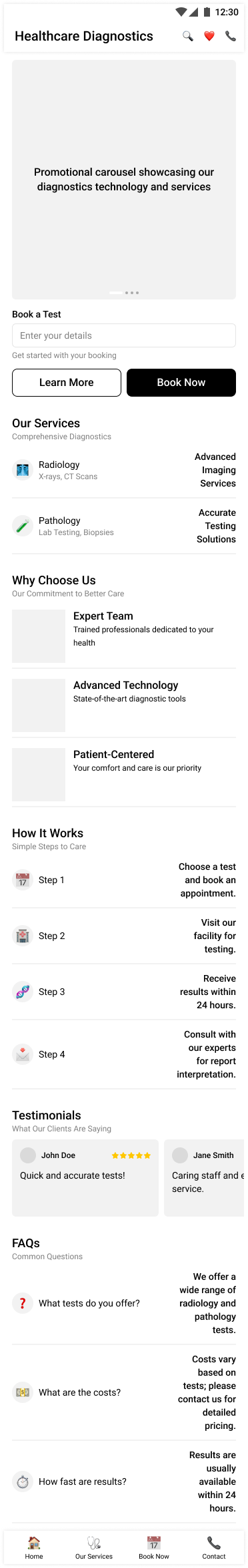
Designing a clean, trust-driven, and responsive healthcare web application. I focused on organizing fragmented medical history into a unified dashboard, improving readability and patient confidence across all devices.

Making Healthcare Information Easy to Understand

Managing healthcare data is often overwhelming — patients must deal with medical reports, prescriptions, appointments, and history across different platforms and devices.

MediCheck was designed to bring everything into one clean, responsive web experience, allowing users to access, understand, and manage their health information effortlessly — whether on desktop, tablet, or mobile.

1

The Problem

  • Fragmented Health Information: Users had to manage prescriptions, reports, and appointments across multiple platforms, making it difficult to track their complete medical history.
  • Poor Readability & Navigation: Many healthcare interfaces were cluttered, with small text and confusing layouts that made critical information hard to understand — especially on mobile devices.
  • Lack of Trust in Digital Healthcare Tools: Inconsistent UI, unclear data presentation, and weak visual hierarchy reduced user confidence when dealing with sensitive medical information.
2

The Solution

  • Unified Health Dashboard: All medical records, appointments, prescriptions, and history are organized into a single, easy-to-navigate interface.
  • Clean & Accessible UI Design: Large typography, clear spacing, and soft healthcare-friendly colors improve readability and reduce cognitive load across all screen sizes.
  • Fully Responsive Web Experience: The interface adapts seamlessly across desktop, tablet, and mobile, allowing users to manage their health anytime, anywhere.

Visual Identity

A calm, trustworthy, and modern visual system designed for healthcare — focused on clarity, accessibility, and emotional comfort for patients accessing sensitive medical information across all devices.

Typography

Aa

Poppins

Poppins is used across headings, navigation, and body content to provide a clean, friendly, and professional healthcare experience. Its rounded, geometric structure improves readability while maintaining a modern, trustworthy tone—ideal for medical dashboards and patient-facing interfaces.

Hero Headings & Key Medical Actions
Section Titles & Service Categories
Card Titles, Reports & Test Names

A consistent typography system ensures medical data, reports, and instructions remain easy to scan and understand across desktop, tablet, and mobile layouts.

Color Palette

Primary Blue (Brand & CTA) #2B6CB0
Accent Blue (Links & Highlights) #3182CE
Secondary Teal (Icons & Process Flow) #38B2AC
Card & Surface #FFFFFF
Light Background #F7FAFC
Borders & Dividers #E5E7EB
Body Text #4A5568
Headings #1A202C

Final Thoughts

This project demonstrates how thoughtful UX and responsive design can transform complex healthcare information into a clear, human-centered digital experience. By organizing medical records, test results, and appointments into an intuitive, easy-to-navigate interface, MediCheck empowers users to take control of their health with confidence and clarity.

The final outcome strengthens trust, improves accessibility across all devices, and positions MediCheck as a modern, reliable healthcare web platform built for patients, families, and medical service providers alike.

More Case Studies

Interested in working together?

I'm a product designer focused on creating meaningful experiences that solve real problems. Let's discuss how we can collaborate on your next project.

Let's Talk