Design System Architecture · Component Foundations
2024
UI FOUN- DATIONS
A systematic approach to building the design foundation — defining the complete color palette,
typography scale, and visual tokens before a single UI component is created. Inspired by
Google's design system methodology.
The Challenge: Aligning User Need with System Clarity
Colors, type, spacing — these are not afterthoughts. They are the DNA of every interface
that follows.
The Core Friction Points
Color Chaos
Multiple near-identical shades used across screens with no token naming —
creating a brittle, inconsistent palette impossible to maintain or hand off to
developers.
Type Anarchy
Ad-hoc font sizes set intuitively per screen without a structured scale,
resulting in inconsistent visual hierarchies across the product.
Accessibility Blind Spots
Color choices made for aesthetic appeal without validation against WCAG contrast
requirements — failing vulnerable user groups silently.
The Engineered Solutions
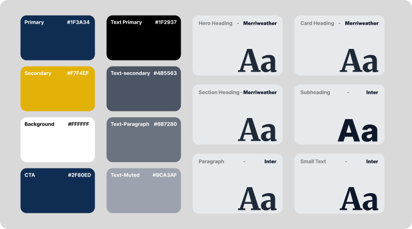
Semantic Color Tokens
Core colors mapped to functional tokens (--color-primary, --color-cta,
--color-bg) enabling consistent usage and instant theme-level changes.
Typographic Scale Ladder
An 8-step type scale (12px → 56px) with defined weight pairings for display,
heading, body, and caption contexts.
Contrast Validation
Every foreground/background color pair validated to WCAG AA or AAA standard using
automated contrast ratio calculation.
Chapter 02 · Visual Transformation
The Transformation in Action
Drag the interactive slider below to inspect the design evolution from preliminary concept
to high-conversion production architecture.
Interactive Before & After Comparison
Drag handle left / right or scrub on touch
Initial ConceptEngineered Output
Chapter 03 · Design Foundations
Design System & Visual Tokens
Constructed an authoritative design system balancing technological precision, responsive
adaptability,
and pristine legibility. Click any color swatch to copy its variable token.
Typography Hierarchy
Inter / Poppins
Live Weight:
Display Heading
UI FOUN- DATIONS
Section Header (600 SemiBold)
Engineered for Scalable Performance
Body Copy (400 Regular)
Designed with high visual fidelity, seamless micro-interactions, and accessible
contrast ratios across all breakpoints.
Color Architecture
Click swatch to copy
Primary Forest#1F3A34--color-primary-forest
CTA Blue#2F80ED--color-cta-blue
Accent Gold#E5B94E--color-accent-gold
Curated palette establishing brand authority, strong visual affordances, and WCAG AAA
contrast
compliance across dark and light surfaces.
Chapter 04 · High-Fidelity Design
Interface Showcase & User Journeys
Every interface was designed to eliminate cognitive friction, communicate parameters
clearly,
and drive seamless conversion. Click any screen to view in full resolution.
Interface ArchitectureProduction Interface 1
Chapter 05 · Results & Appraisal
Data-Backed Gains & Feedback
The redesign delivered immediate measurable business impact, improving engagement metrics,
retention, and stakeholder satisfaction.
+80%Design SpeedFaster new screen production when starting from token-based
foundations vs. ad-hoc design.
+70%Consistency GainReduction in color and typography inconsistencies across
multi-screen product flows.
4.9★Adopter SatisfactionAverage rating from designers and developers who adopted the
system in their projects.
−60%Rework ReductionDecrease in design revision cycles caused by inconsistent
visual hierarchy decisions.
★★★★★
Verified Feedback
""UI Foundations is one of the most well-documented and immediately usable design
systems I've come across. The typography pairing of Merriweather and Inter is
inspired — it works across both editorial and product contexts flawlessly. This
system saves hours on every project.""