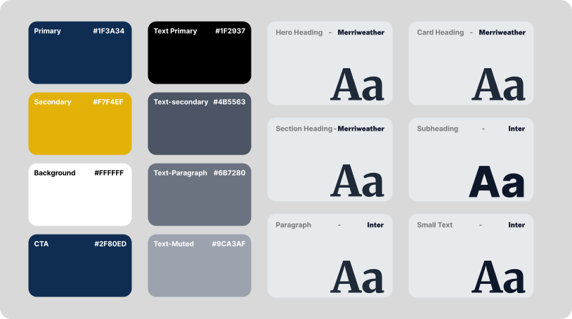
A systematic approach to building the design foundation — defining the complete color palette, typography scale, and visual tokens before a single UI component is created. Inspired by Google's design system methodology.
Before designing a single screen, I define the visual language. Colors, type, spacing — these are not afterthoughts. They are the DNA of every interface that follows.
— Manav Tyagi, on building design foundations first
Four core colors and four text tokens — chosen with intention, tested for contrast, and mapped to specific UI roles.
Every text element maps to a specific token — ensuring consistent hierarchy and readability.
Merriweather for authority. Inter for clarity. A deliberate pairing that balances editorial presence with modern readability.
The serif workhorse — used for hero headings, section titles, and card headings. Delivers editorial weight and visual authority.
The sans-serif complement — optimized for screen readability at every size. Handles subheadings, paragraphs, labels, and small text.
Each level in the hierarchy has a defined font, weight, and size — no guessing.
A design system is not a component library. It begins with the smallest decisions — the color of body text, the weight of a heading, the rhythm of whitespace between elements. These foundational tokens propagate through every screen, every state, every interaction. Get them right, and everything downstream becomes coherent.
Last updated · July 2026 · Design System v1.0
This section itself uses the UI Foundations palette — the secondary background, primary text, and CTA blue. The system, demonstrated live.
When every color, font, and spacing value is a token, scaling from one page to fifty is not a redesign — it's a deployment. The system carries the design intent forward.
Learn moreEach text color token was tested against its intended background. Primary text (#1F2937) on white achieves a contrast ratio of 13.5:1 — exceeding WCAG AAA standards.
View contrast ratiosThe primary green (#1F3A34) anchors the brand identity. It appears in headers, icons, and accent details — creating a thread that ties every element together.
See applicationsMerriweather's high x-height serif forms command attention in headings. Inter's clean geometry disappears into content, letting the message — not the font — be the focus.
Explore type systemEvery visual decision documented as a reusable token — the blueprint that ensures design consistency across the entire product.
| Token | Value | Usage | Category |
|---|---|---|---|
| --color-primary | #1F3A34 | Header backgrounds, nav, brand anchoring | Color |
| --color-secondary | #F7F4EF | Section backgrounds, card surfaces | Color |
| --color-bg | #FFFFFF | Page base canvas, content areas | Color |
| --color-cta | #2F80ED | Buttons, links, interactive elements | Color |
| --text-primary | #1F2937 | Headings, primary body content | Text |
| --text-secondary | #4B5563 | Subheadings, supporting text | Text |
| --text-paragraph | #6B7280 | Body paragraphs, descriptions | Text |
| --text-muted | #9CA3AF | Captions, timestamps, metadata | Text |
| --font-heading | Merriweather | Hero, section, and card headings | Type |
| --font-body | Inter | Subheadings, paragraphs, UI elements | Type |
A design system is not a deliverable — it's a living foundation that evolves with every product decision. UI Foundations represents my approach to starting every project right.
By defining colors, typography, and tokens before any screen design begins, I eliminate inconsistency at the source. This system — with Merriweather's editorial authority and Inter's screen-optimized clarity — provides a vocabulary that scales from a single landing page to an entire product ecosystem. The foundation is set. Now, everything built on top inherits its intent.
Feedback from design collaborators and developers who adopted the system.
"UI Foundations is one of the most well-documented and immediately usable design systems I've come across. The typography pairing of Merriweather and Inter is inspired — it works across both editorial and product contexts flawlessly. This system saves hours on every project."
Efficiency and consistency gains from adopting the design system.