Why I Kept Coming Back to Stitch 2.0
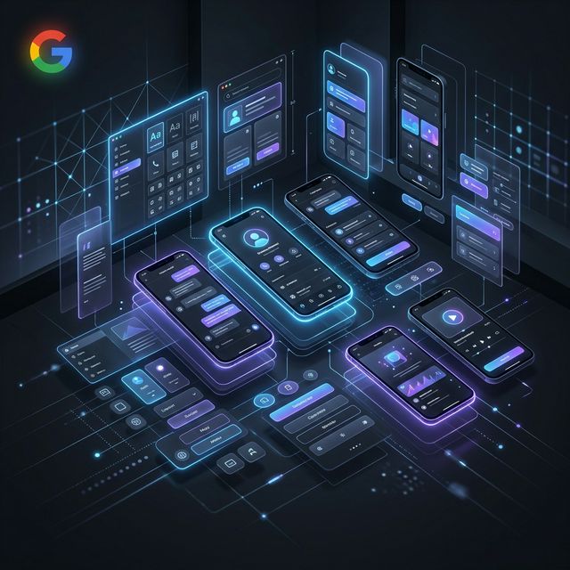
What is Google Stitch 2.0? Stitch 2.0 is Google's AI-powered UI design generation platform. You describe or sketch what you need, and it generates fully structured, production-ready screen layouts — complete with components, spacing tokens, and interactive state previews.
The Key Changes That Actually Matter
-
Multi-Screen Context MemoryStitch 2.0 now holds the context of your entire app flow across screens. When you generate a new screen, it references the design language, component styles, and interaction patterns of your previous screens — ensuring visual and UX coherence across every view without you manually enforcing it.
-
Immersive Full-Bleed GenerationOne of the biggest design shifts I've noticed is how Stitch 2.0 handles space. Earlier versions were conservative — safe margins, standard card layouts. V2 natively generates full-bleed hero sections, edge-to-edge media views, and layered depth compositions that feel premium right out of the box.
-
Adaptive Component IntelligenceThe component library in 2.0 is now deeply adaptive. If you're building a dark-mode first app, Stitch auto-tunes contrast ratios, icon weights, and surface hierarchies. It understands the semantic role of each component — not just its visual appearance — and adjusts accordingly based on your stated design intent.
-
Interaction State PreviewsStitch 2.0 generates hover, pressed, focused, and disabled states for interactive elements automatically. This is a massive time-saver — previously, detailing every interactive state was a manual, tedious process. Now it's baked into the generation output, giving developers a complete picture from day one.
-
Typographic Hierarchy EngineTypography drives user comprehension. Stitch 2.0 includes a layout-aware typographic engine that automatically scales type sizes, adjusts line-heights, and manages information density across screen sizes. It understands when a screen needs breathing room and when it needs information density.
How I Actually Use Stitch 2.0 Day-to-Day
| Step | Activity | How Stitch 2.0 Helps |
|---|---|---|
| 01 | Intent Setting | I describe the screen's purpose, the user's emotional state at that moment, and the primary action I want them to take. Stitch 2.0 uses this to inform layout weight, CTA prominence, and visual hierarchy. |
| 02 | Initial Generation | Stitch produces 3–4 layout variants for the screen. I don't pick one blindly — I extract the best structural ideas from each and guide the next iteration. It's a conversation, not a command. |
| 03 | Immersive Layer Refinement | I use Stitch's depth controls to push key elements forward — adding parallax-ready layers, elevation shadows, and ambient color bleeds that give the screen a tactile, three-dimensional feel. |
| 04 | Cross-Screen Consistency Check | Stitch 2.0 runs a consistency audit across all generated screens, flagging mismatched spacing, inconsistent type scales, or deviating color tokens. This replaces what used to be hours of manual QA. |
| 05 | Export & Handoff | Screens export with structured token sheets and annotated measurements. Developers don't have to reverse-engineer the design — it's documented automatically in the output package. |
Pro Tip: Don't treat Stitch 2.0 as a one-shot generator. The best results come from iterative prompting — start broad, then progressively refine the layout, depth, and component semantics through 3–5 rounds of guided generation.
What "Immersive" Actually Means in App Design
Visual Depth
- Layered element stacking with intentional z-indices
- Ambient light and surface glow for premium feel
- Full-bleed imagery that doesn't feel cropped
Motion Readiness
- Screens are structured for entrance animations
- Transition-friendly layout hierarchies
- State changes that feel fluid and physical
Colour Intelligence
- Dynamic tonal surfaces (not flat blocks)
- Adaptive accent colours based on content
- WCAG-compliant contrast without compromising aesthetics
Spatial Awareness
- Content that respects notches, safe areas, home bars
- Thumb-zone optimized primary action placement
- Scrollable depth that feels rewarding to explore
Stitch 2.0 bakes all of these considerations into every screen it generates. It's not just thinking about what a screen looks like at first glance — it's thinking about how it feels to use over time, which is the definition of truly immersive app design.
Stitch 2.0 vs Traditional Workflows
| Capability | Traditional Figma Workflow | With Stitch 2.0 |
|---|---|---|
| Initial Ideation | Hours of sketching, wireframing, manual layout | Minutes — 3–4 high-fidelity variants generated instantly |
| Cross-Screen Coherence | Manual style guide enforcement; easy to drift | Automated by the multi-screen context memory |
| Interactive States | Manually designed for each component | Auto-generated (hover, pressed, disabled, focused) |
| Immersive Feel | Requires deep expertise in composition & depth | Built into the generation model's design language |
| Dev Handoff | Requires manual annotation and spec documentation | Structured token sheets exported automatically |
The Right Framing: Think of Stitch 2.0 as your ideation and architecture layer. Use it to get to a strong skeleton fast. Then move into Figma for the craft refinement — micro-interactions, custom illustration integration, and final production polish. They're complementary, not competing.
My Take: Stitch 2.0 Has Made Me a Better Designer
I'll be honest — when AI design tools first started appearing, I was sceptical. The outputs were generic, the layouts were predictable, and the \"AI magic\" often produced screens that looked AI-generated in the worst way. Stitch 2.0 is different. It has genuine design intelligence, and spending enough time with it has sharpened my own eye for layout and composition.
- For Junior Designers: Stitch 2.0 is like having a senior designer review your layout decisions in real time. The generated variants show you compositional approaches you might not have considered.
- For Mid-Level Designers: It compresses your exploration phase dramatically, letting you spend more time on the high-value craft work — motion, micro-copy, and experience polish.
- For Senior Designers: It's a force multiplier. You can explore 10x more design directions in the same time, and use your expertise to curate and elevate the best ideas rather than starting from a blank canvas every time.
If you design apps and haven't seriously evaluated Stitch 2.0 yet, I'd strongly encourage you to do so. It's not a shortcut — it's a genuinely different and more effective way to design screens that people actually love to use.