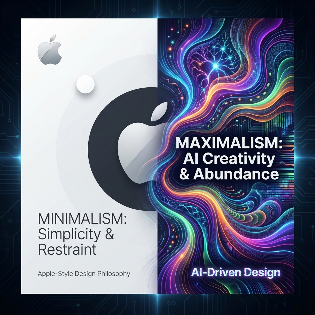
Apple-Style Minimalism vs AI-Driven Maximalism
Less is More
"Simplicity is the ultimate sophistication." — Steve Jobs
Apple's approach isn't just about aesthetics — it's about cognitive
load. By removing visual clutter, users can focus on what matters.
More is More
Apple Minimalism
- White space as a feature
- Limited color palettes
- Typography-first hierarchy
- Invisible interfaces
- Human-crafted intentionality
AI Maximalism
- Every pixel tells a story
- Vibrant, dynamic gradients
- Layered, textured surfaces
- Immersive visual worlds
- Generative spontaneity
The Psychological Divide
Finding the Synthesis
-
Controlled ComplexityUse AI-generated textures as subtle backgrounds, not focal points.
-
Hierarchy FirstLet complex visuals support clear info architecture, never compete with it.
-
Context SwitchingApply maximalism for emotion, minimalism for function.
-
User ChoiceOffer themes that let users select their preferred visual density.
Apps That Got It Right
Spotify: Adaptive Density
Spotify's interface is a masterclass in contextual design. The core navigation is minimalist, but the content explodes with color.
Notion: Structured Flexibility
Notion proves that minimalism doesn't mean boring. The base is simple, but allows for user-generated complexity.
When Minimalism Wins
- Productivity tools
- E-commerce checkout
- Dashboards
- Accessibility-critical apps
When Maximalism Wins
- Entertainment apps
- Brand storytelling
- Social & Community
- Marketing pages
When to Use Each Style
-
What is the user's goal?Task completion → Minimalism. Exploration/inspiration → Maximalism can work.
-
How much time do they have?Quick tasks need minimalism. Leisurely browsing can handle visual richness.
-
What emotion are you designing for?Calm and focus → Minimalism. Excitement and wonder → Maximalism.
-
What are the accessibility requirements?High accessibility needs → Minimalism wins. Decorative contexts can flex.
Core Principles of Each
| Minimalist Principle | Maximalist Principle |
|---|---|
| Every element must earn its place | Every pixel should tell a story |
| White space is a design element | Pattern and texture add depth |
| Restrain color palette | Embrace color vibrancy |
| Typography leads hierarchy | Imagery creates atmosphere |
| Reduce cognitive load | Create immersive environments |
Where Design is Heading
AI-Adaptive Interfaces
- Personalized visual density
- Context-aware styling
- User preference learning
Spatial Computing
- Minimalist controls
- Rich environments
- Layered information
Prediction: By 2028, most apps will offer user-selectable visual modes—from "minimal focus" to "immersive exploration." One-size-fits-all design is ending.
Implementing the Hybrid Approach
-
Minimalist Core, Maximalist MomentsKeep the navigation and toolbars clean. Reserve rich visuals for hero sections, onboarding, and celebrations.
-
User-Controlled DensityOffer display density settings: Compact, Comfortable, Spacious. Let users choose their cognitive environment.
-
Mode-Based DesignCreate "Focus Mode" (minimal) and "Discovery Mode" (rich). Match the UI to the user's intent.
My Take: The Fluid Future
The future isn't about choosing one side. It's about fluency in both languages. We need to be able to switch between the quiet of Apple and the noise of AI.
- Master Both: Don't limit your toolkit.
- Match Context: Design for the user's mental state.
- Adapt: Static design is dead. Long live adaptive design.