Insight
Trust vs Trends
Trust is the Metric: Reliability beats novelty every time. In high-stakes environments like healthcare or legal tech, a predictable interface isn't boring—it's essential safety infrastructure.
Analysis
The Reality Check
Flashy Design
- Focuses on "Wow" factor
- Hides navigation for minimalism
- Prioritizes trends over usability
- High cognitive load
- Good for portfolios
Reliable Design
- Focuses on "Aha" moments
- Exposes options clearly
- Prioritizes consistency
- Zero friction
- Good for products
Case Study
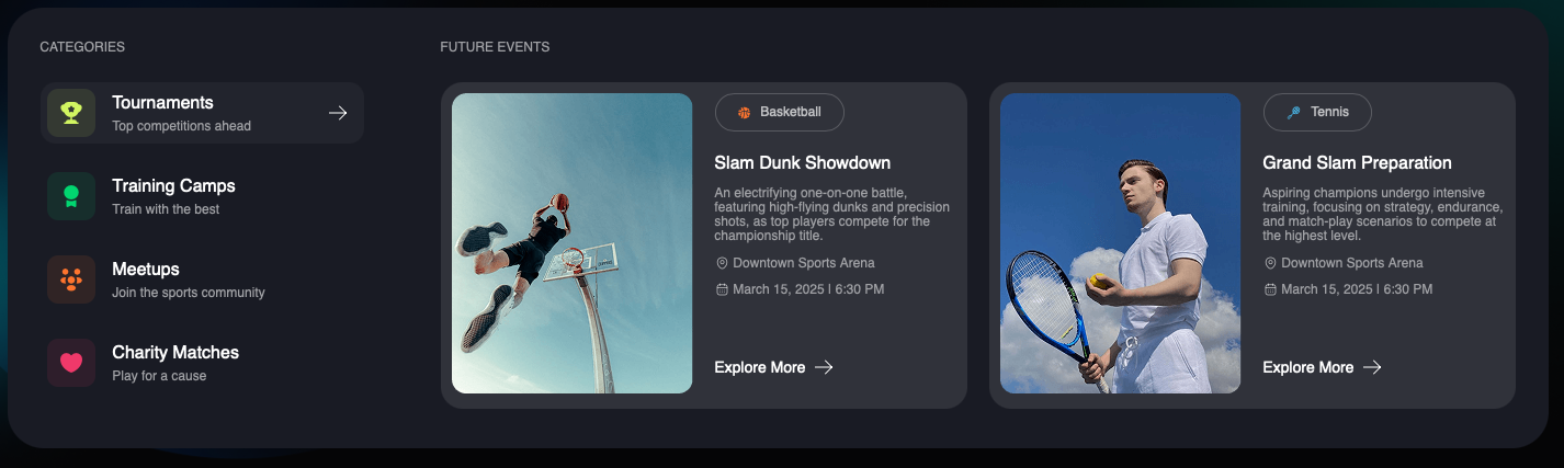
Lessons in Visibility

-
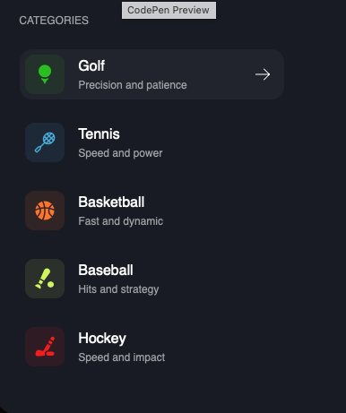
Immediate InsightUsers perceive the full product scope at a glance, reducing navigation anxiety.
-
Intuitive NavigationComplex systems become approachable when the path is visible. It's the "you are here" map of the web.
-
Built-in TrustTransparency in structure leads to higher user confidence. Hidden menus feel like hidden agendas.
Innovation
Systemic Thinking

Patterns
Trust Signals in UI
-
Confirmation FeedbackEvery action should have a visible response. Green checkmarks, success toasts, progress indicators—users need to know their input registered.
-
Reversible ActionsUndo buttons reduce anxiety. When users know they can recover from mistakes, they explore more confidently.
-
Progress VisibilityShow users where they are in multi-step processes. Progress bars, step indicators, and breadcrumbs reduce abandonment.
-
Security IndicatorsFor sensitive data, show security badges, encryption indicators, and privacy assurances. These aren't just decoration—they're UX.
Research
Understanding User Needs
Qualitative
- User interviews
- Contextual inquiry
- Diary studies
- Think-aloud testing
Quantitative
- Task success rates
- Time-on-task metrics
- Error frequency tracking
- NPS & CSAT scores
Examples
Products That Nail Trust
| Product | Trust Mechanism | Result |
|---|---|---|
| Stripe | Clear error messages | Reduced support tickets |
| Linear | Instant feedback | High user satisfaction |
| Notion | Undo everything | Fearless exploration |
| Slack | Edit/delete messages | Reduced communication anxiety |
Key Insight: The best products don't just work—they make users feel smart for using them. That's the ultimate trust signal.
Action
Trustworthy Design Checklist
-
Does every action have feedback?Button clicks, form submissions, state changes—every user action needs a visible response.
-
Are error states helpful?Errors should explain what went wrong AND how to fix it. "Something went wrong" is never acceptable.
-
Can users recover from mistakes?Undo, edit, delete. Make it safe to experiment without fear of permanent consequences.
My Take: Building Trust
Designing products people depend on means going beyond the surface. It requires building systems that make people feel confident and capable.
- Clarity over Style: If they can't understand it, it doesn't matter how nice it looks.
- Map the Journey: Show users where they are and where they are going.
- Build for Trust: Reliability is the ultimate UX feature.